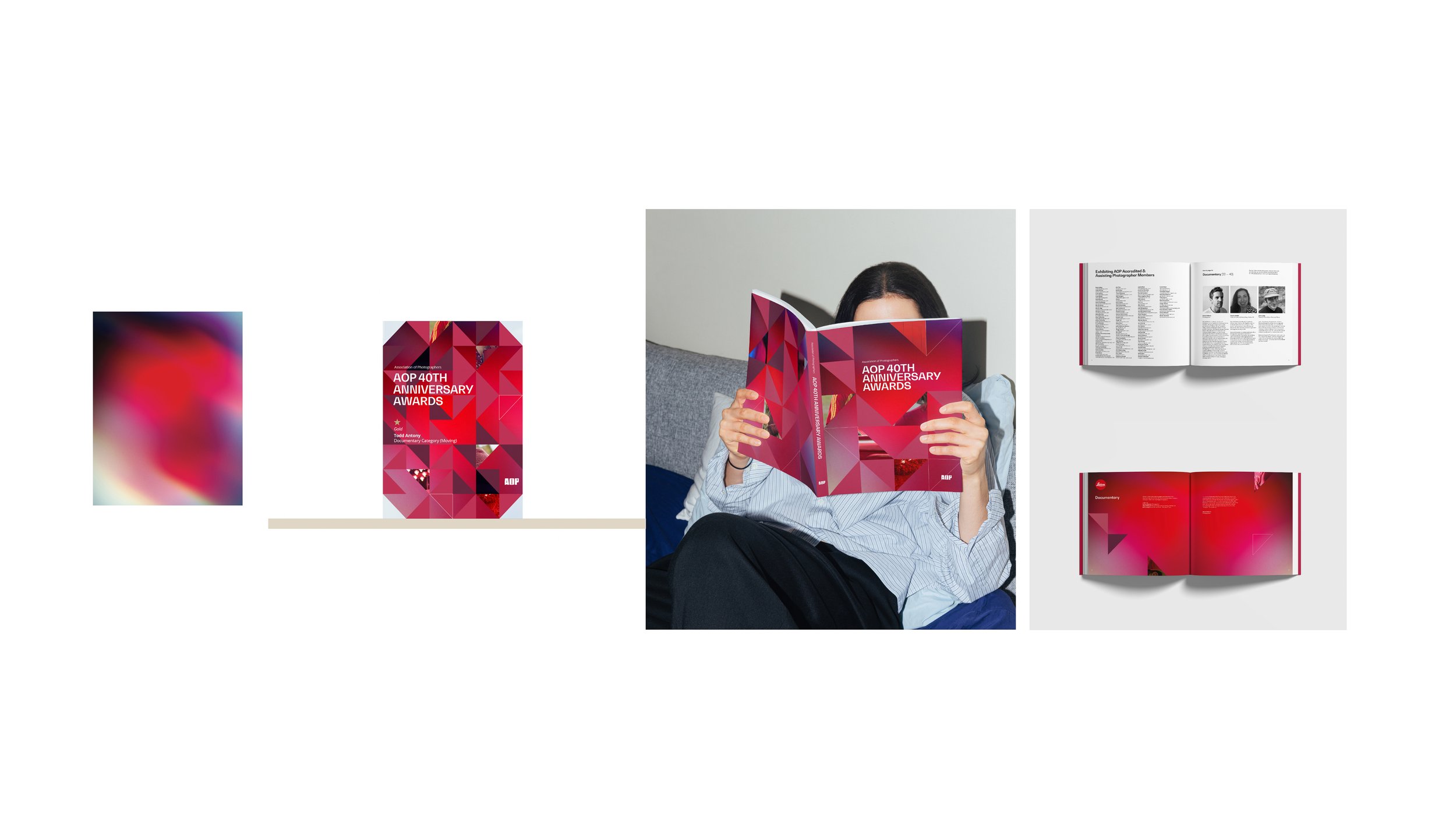
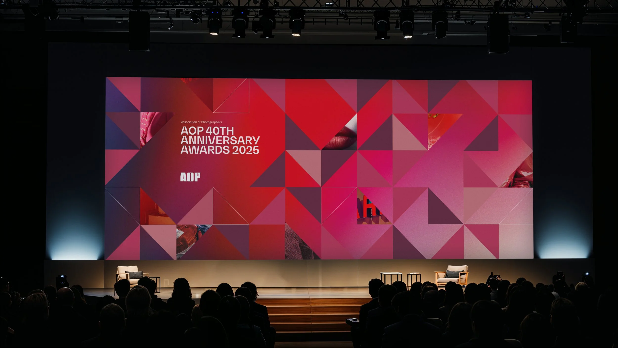
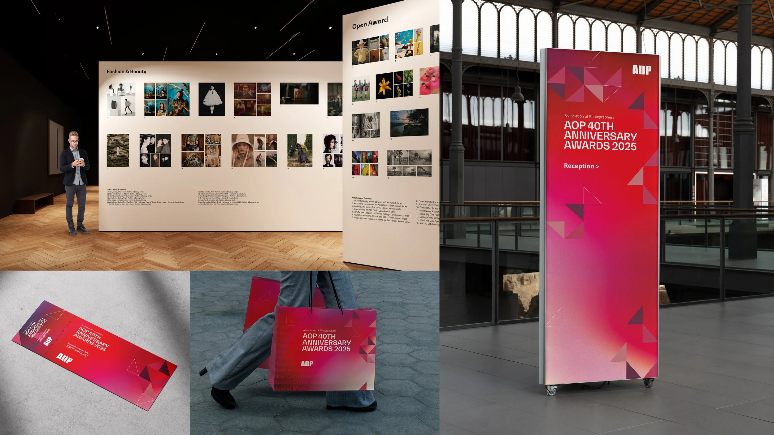

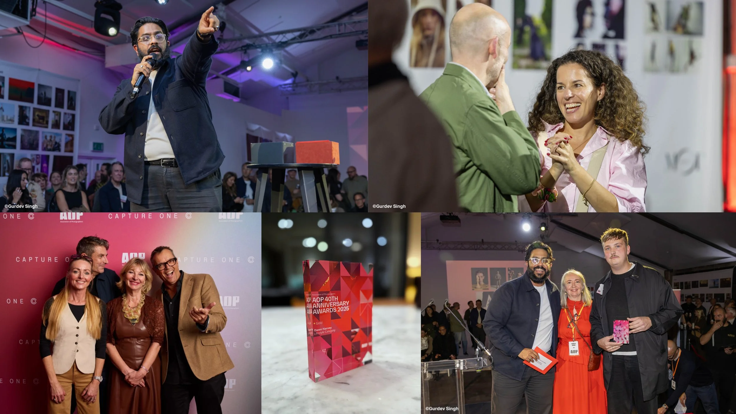

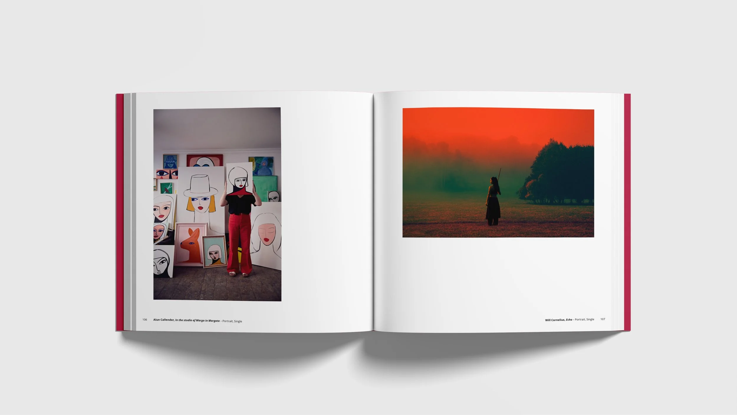
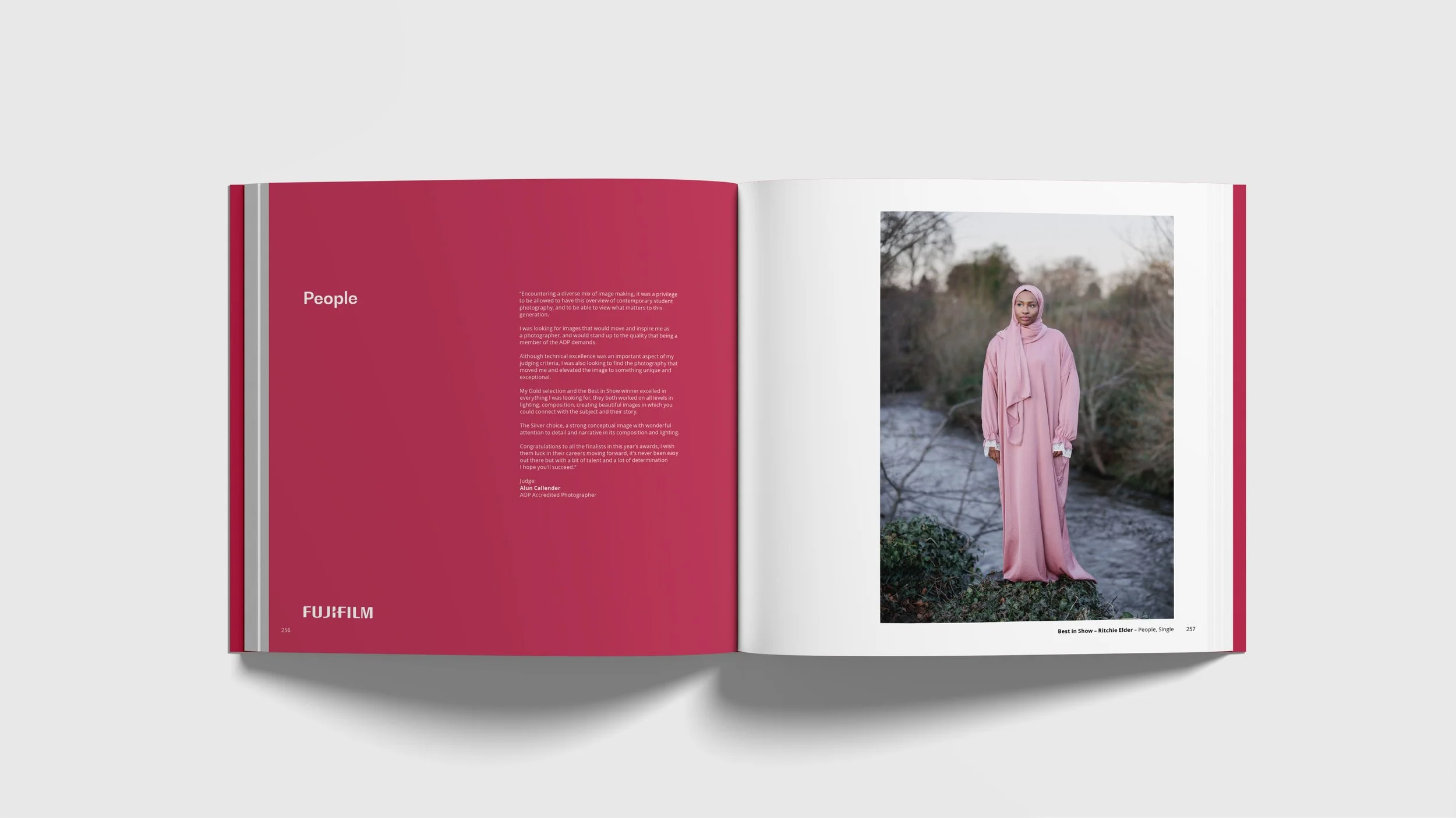
The AOP Awards champion and celebrate incredibly diverse photographic talent across multiple disciplines and categories. I was commissioned by the AOP to create a bespoke visual identity for their 40th Anniversary Awards 2025.
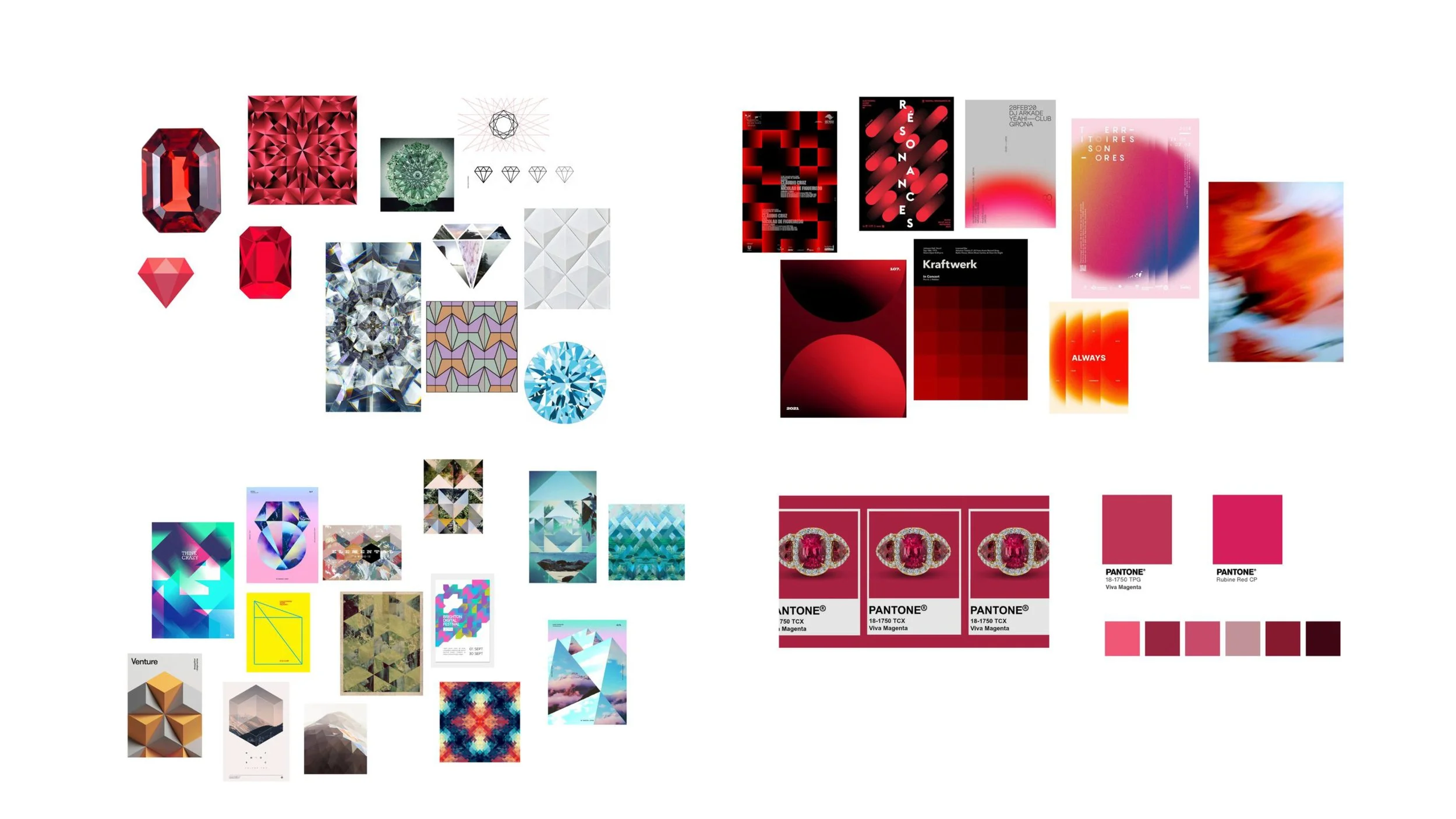
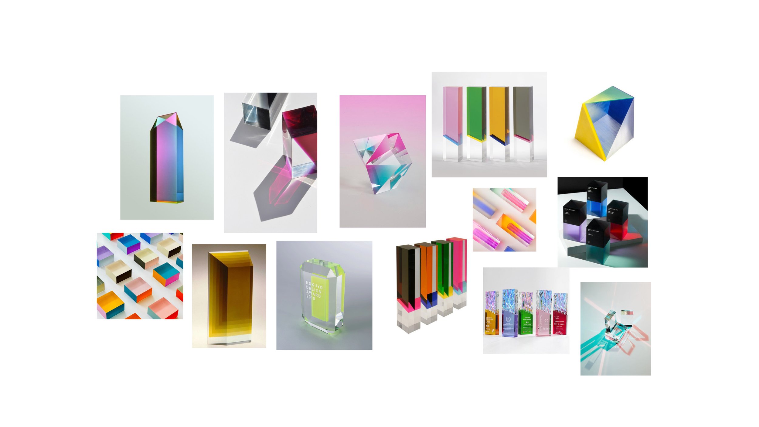
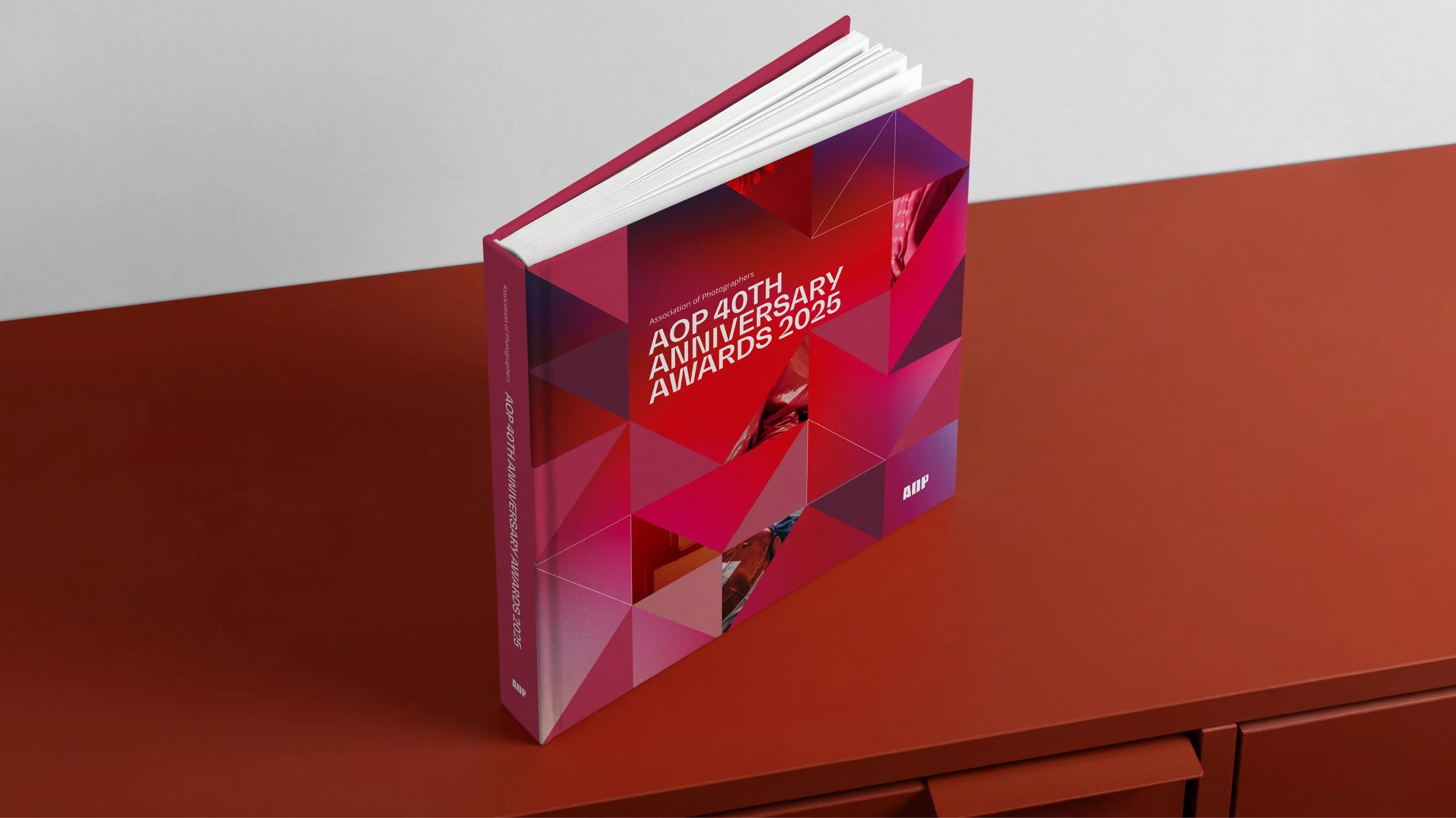
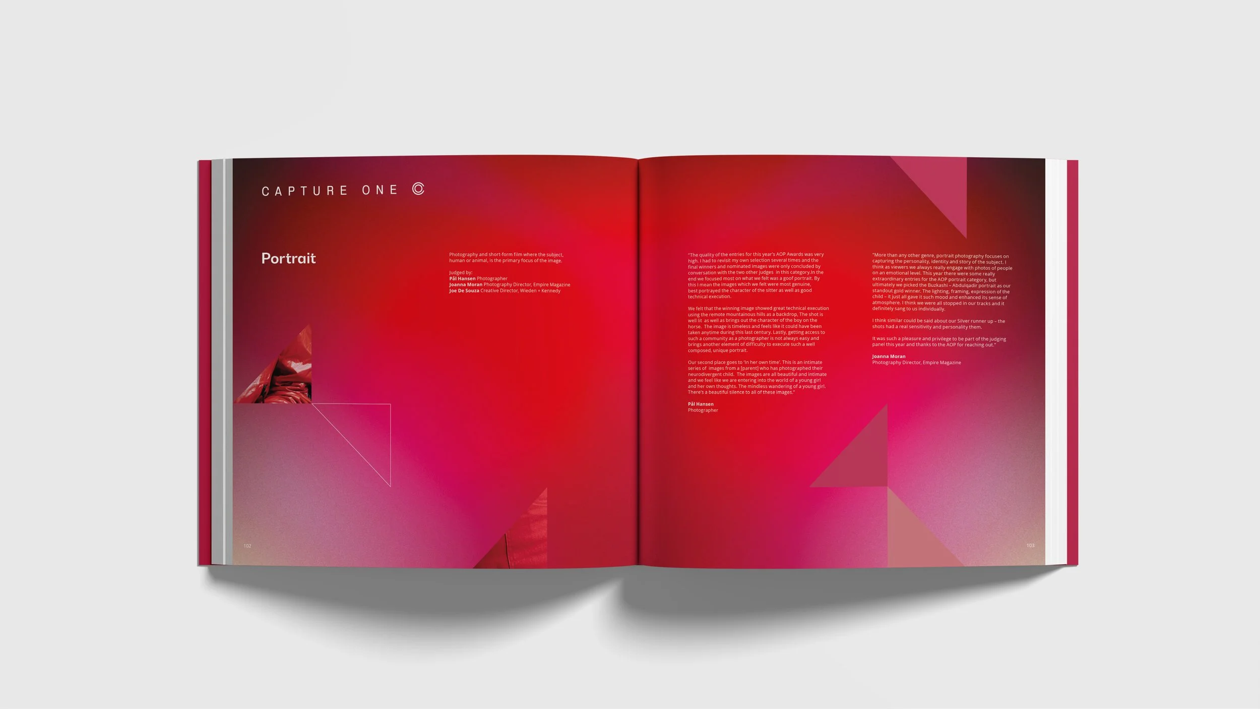
The design of the Awards took its inspiration from the idea of a ruby representing a 40th anniversary.
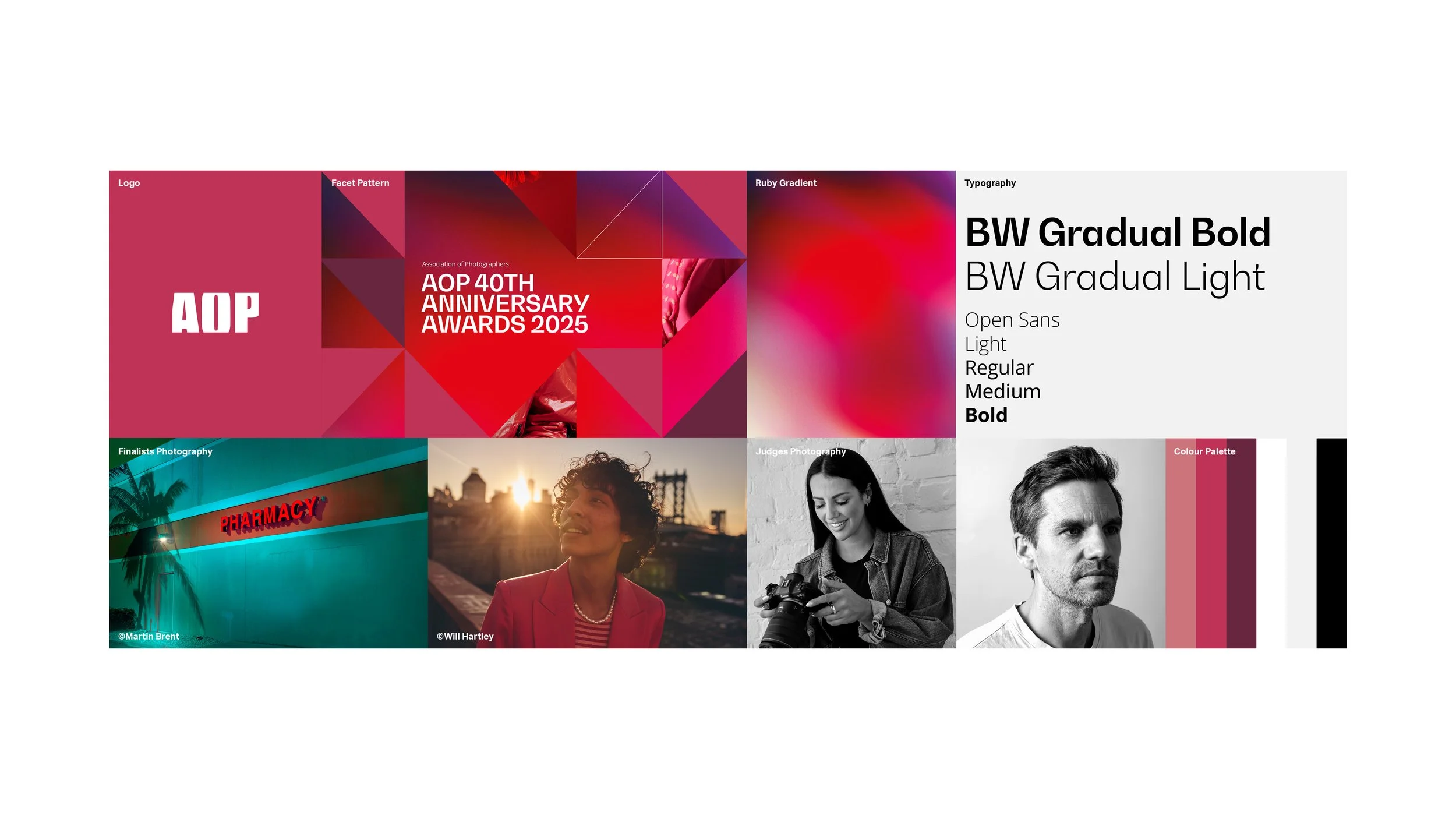
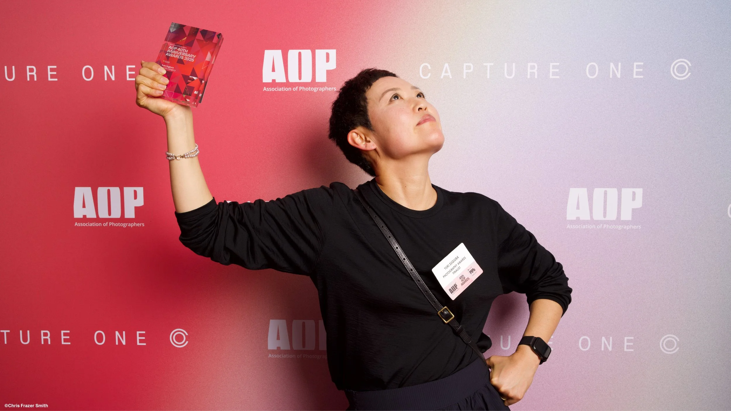
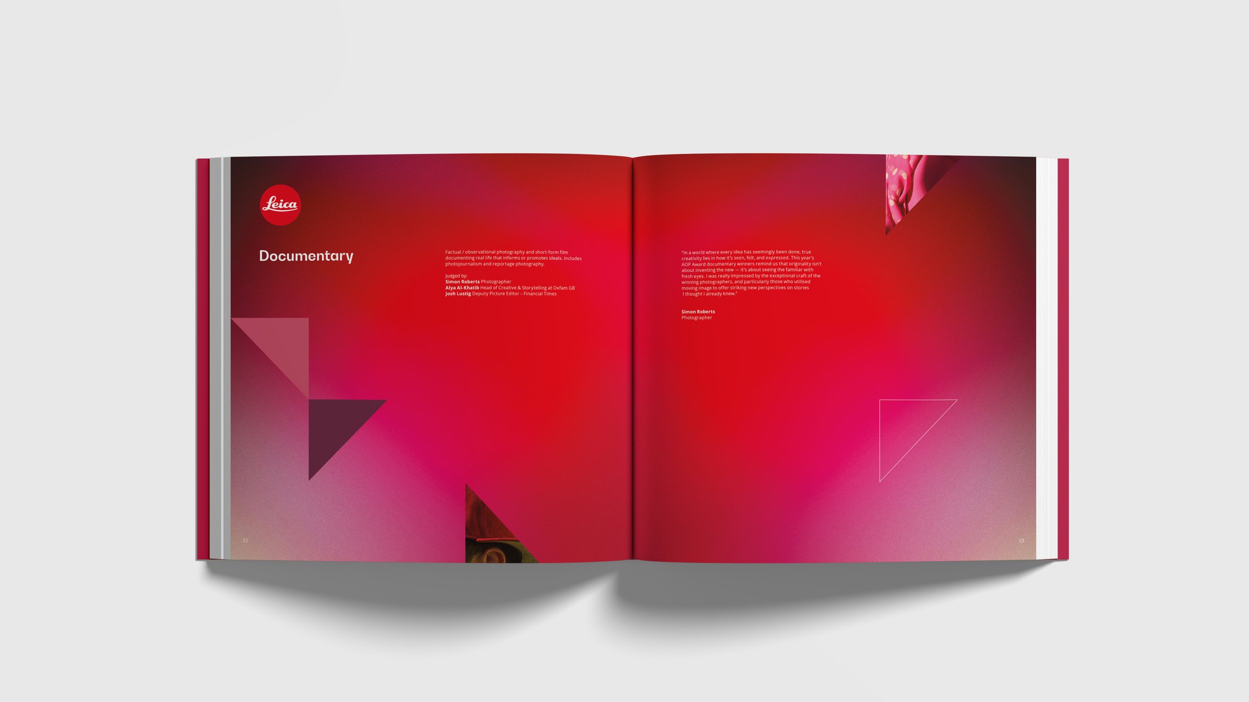
A graphic facet pattern – with a gradient glow, red highlights and shadows – was designed to echo a ruby gemstone. Within the facet pattern are close-up crops of red photographic elements that hint at the images from the finalists. The typeface BW Gradual was chosen for its facet-like characteristics and visual harmony with the AOP logo.
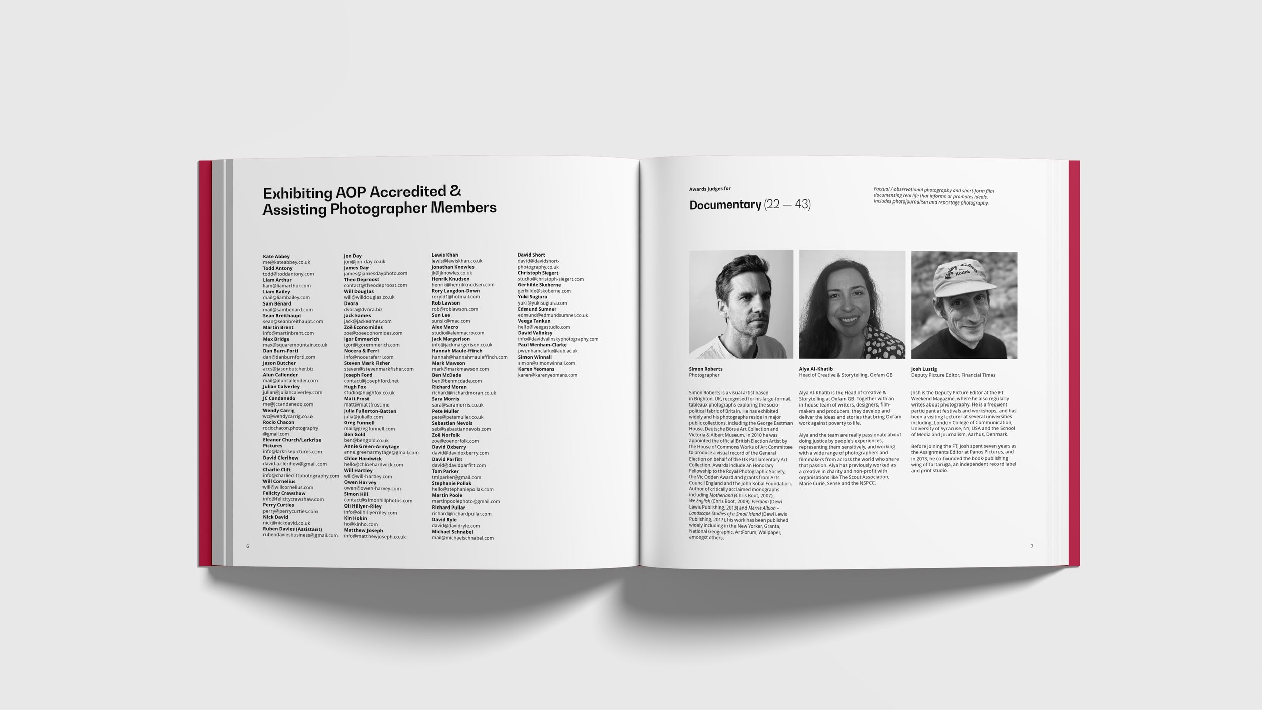
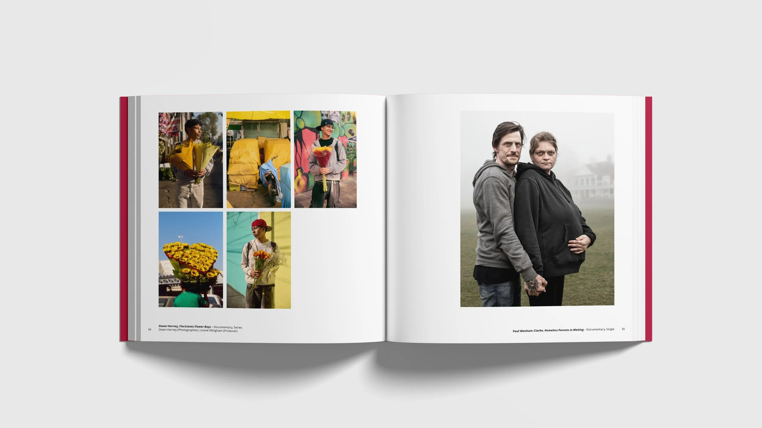
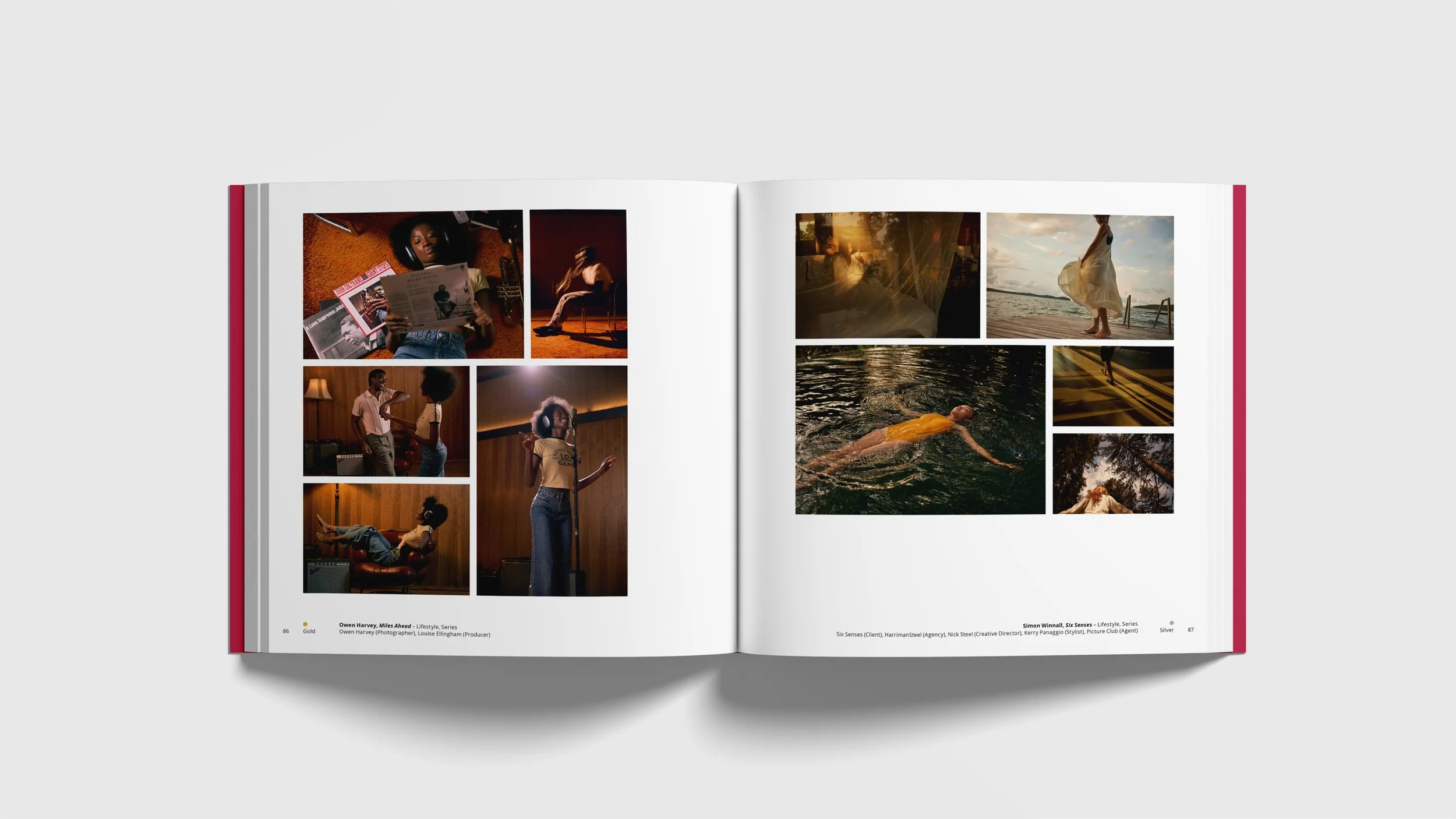
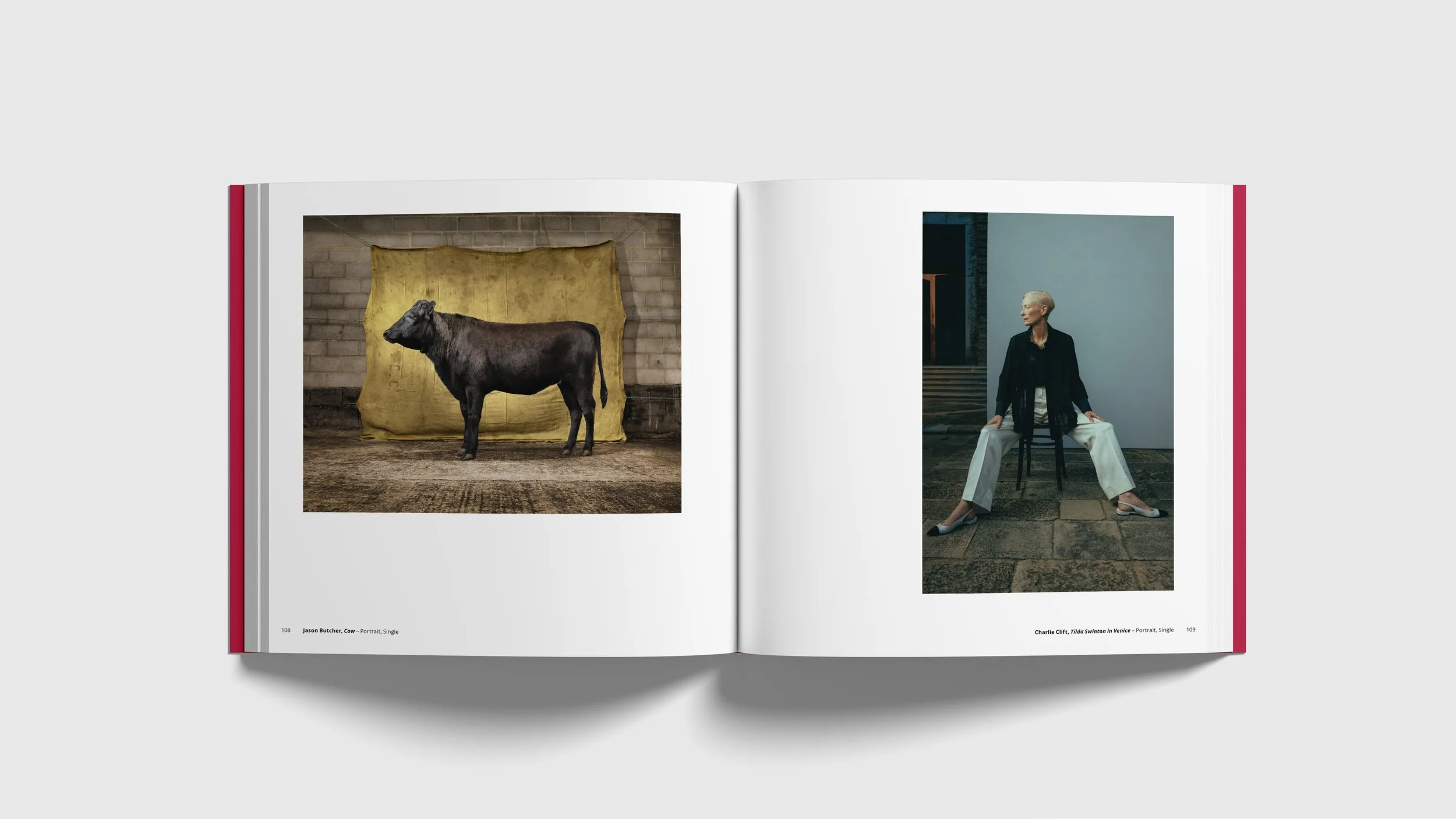
The identity needed to be able to flex across multiple applications; film, awards night venue graphics, category banners, merchandise, signage, ticketing, awards gold and silver plaques, website, social media and a 300 page book with the category finalists photography.
Isabelle Doran
CEO, Association of Photographers
AOP 40th Anniversary Awards 2025 Sizzle Reel by STONE & GLOW