
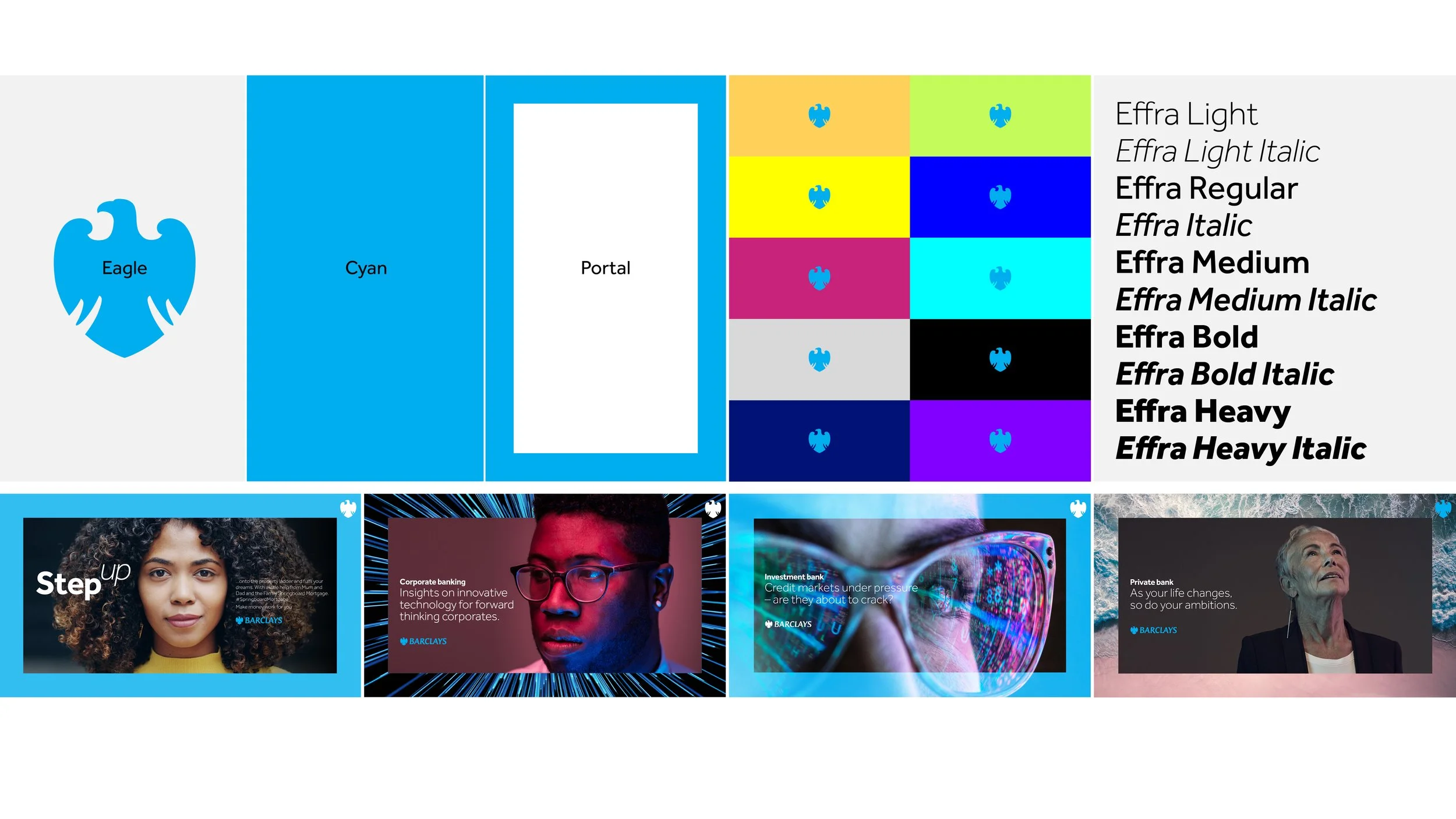
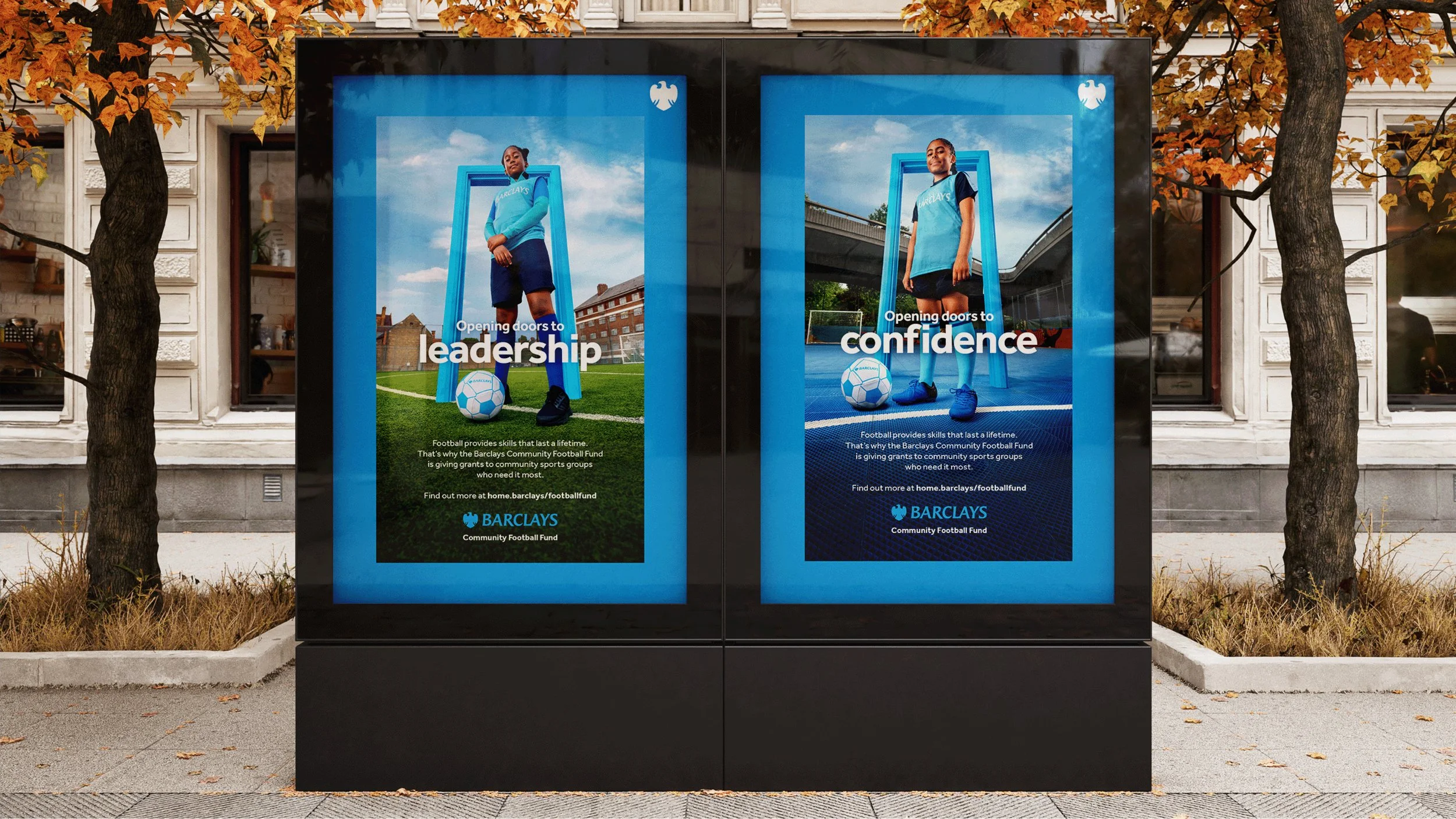
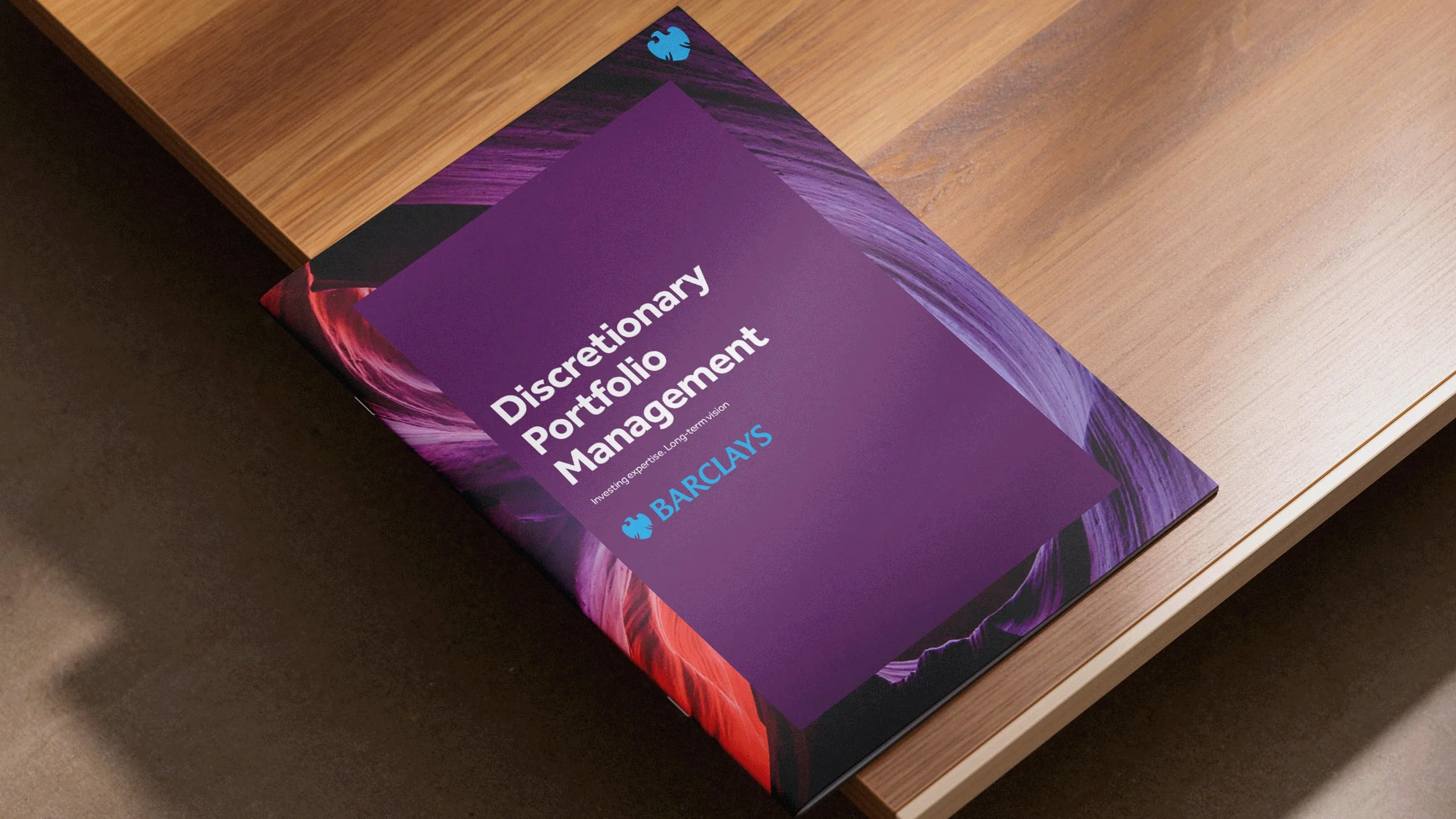
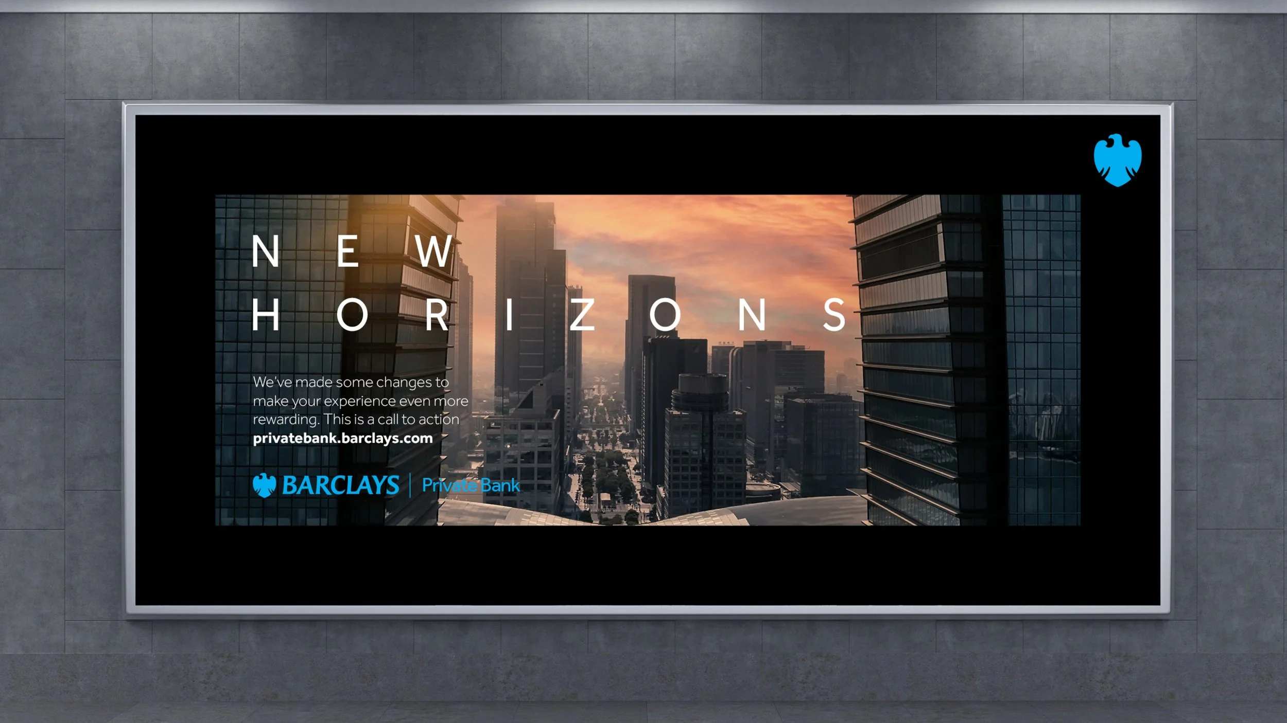

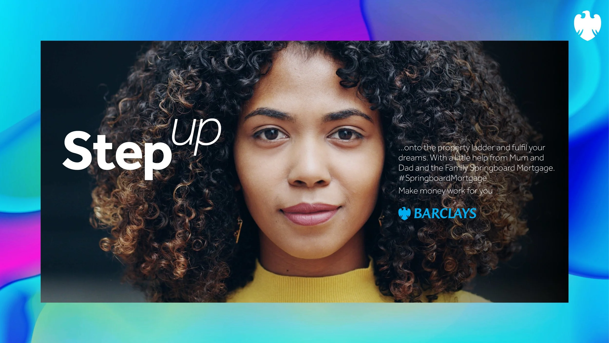





The Barclays rebrand was an 18 month project encompasing all aspects and every division of the business. The creative was driven by a ‘digital first’ philosophy and as a reaction to the new more digitally-led brands such as Monzo and Starling.
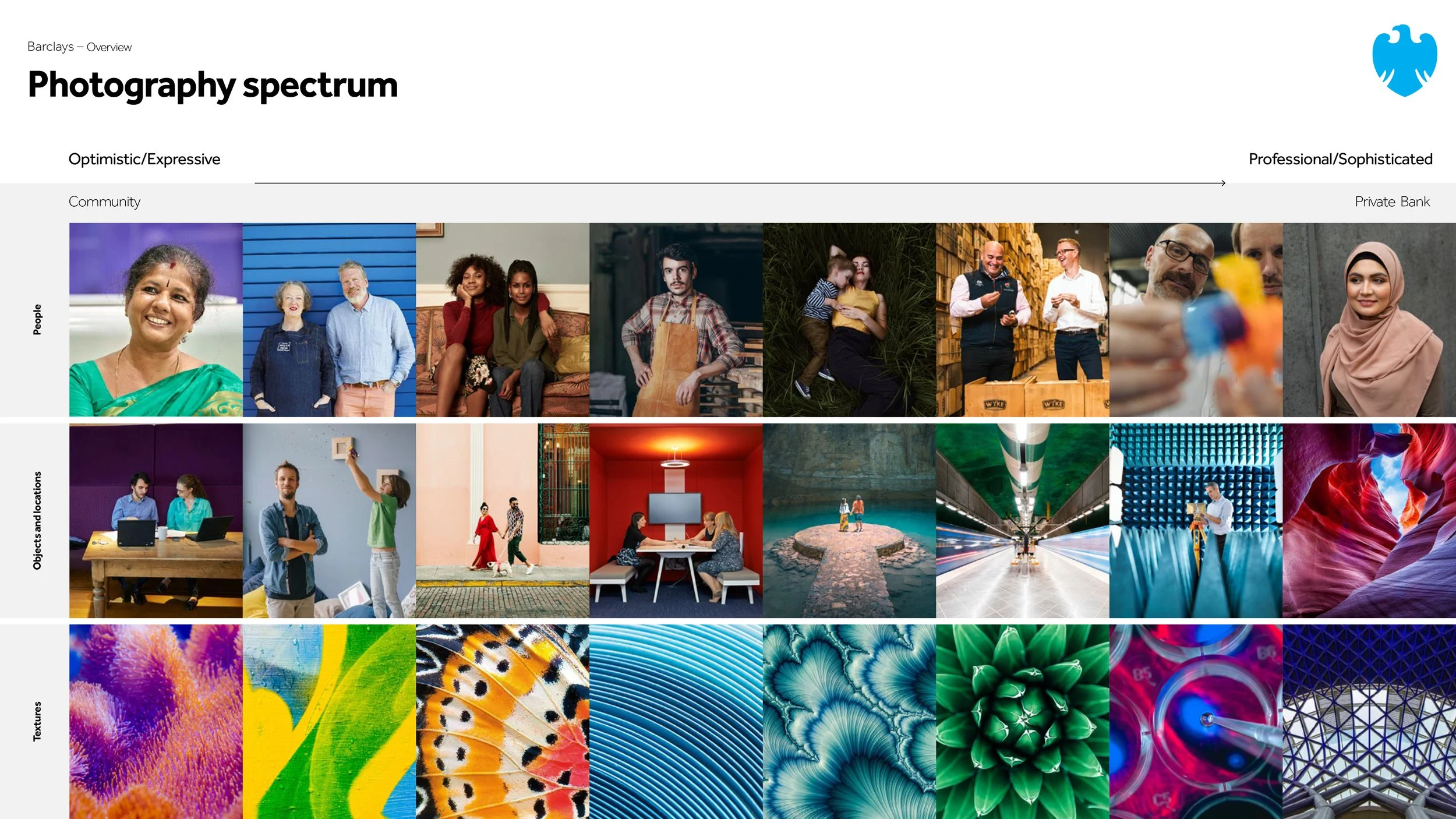
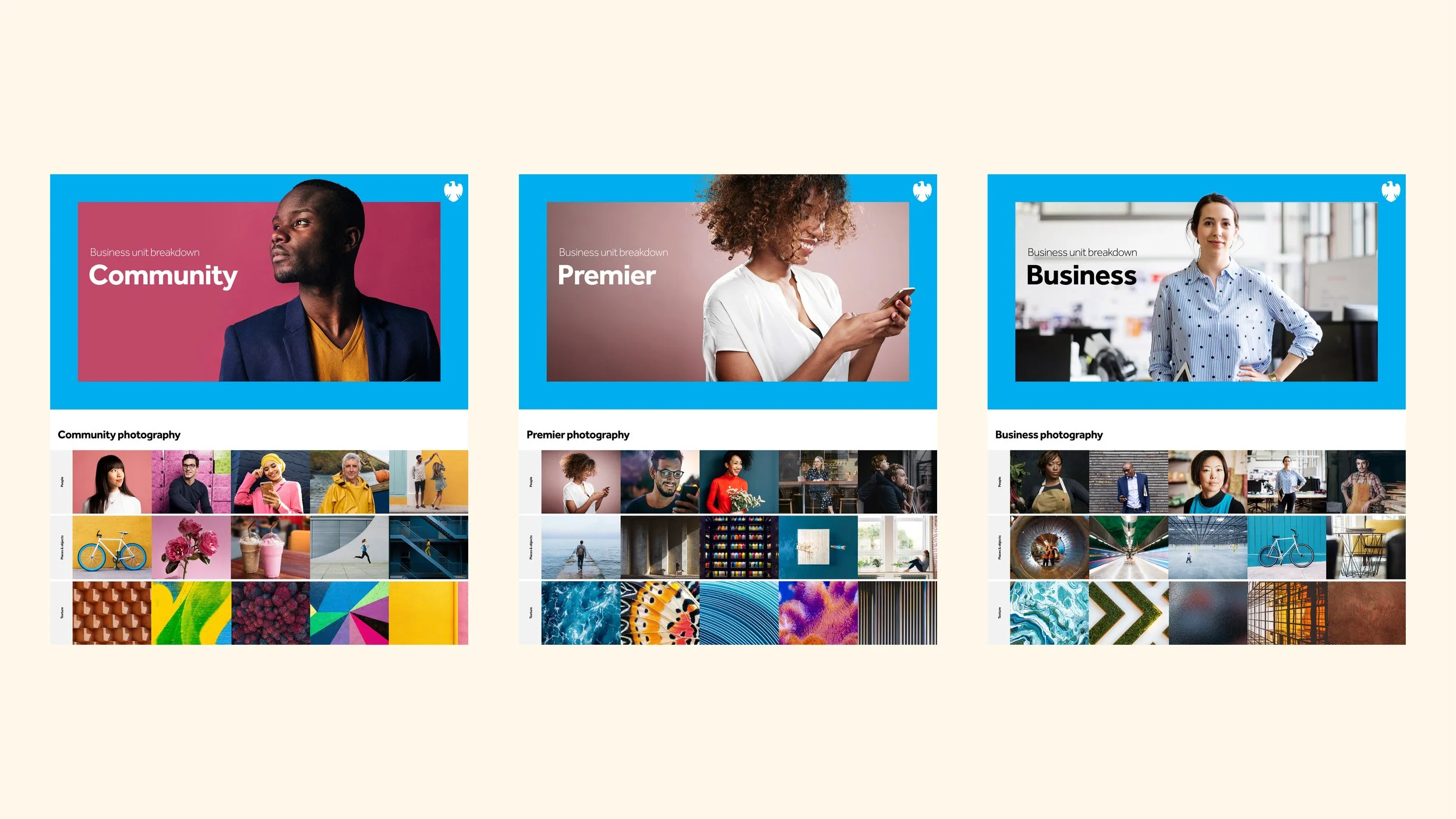
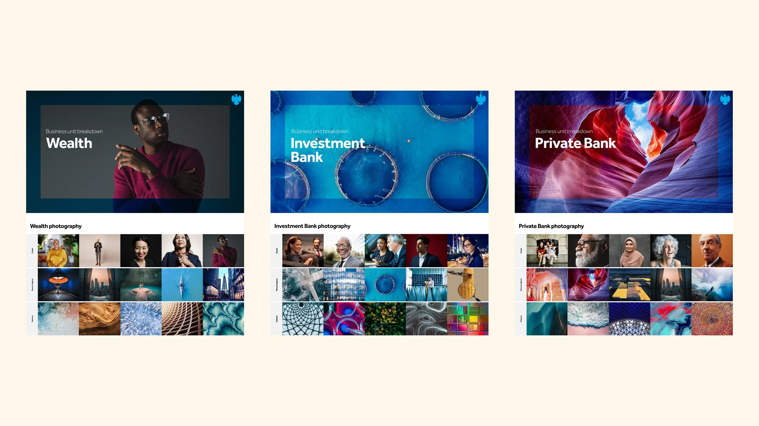
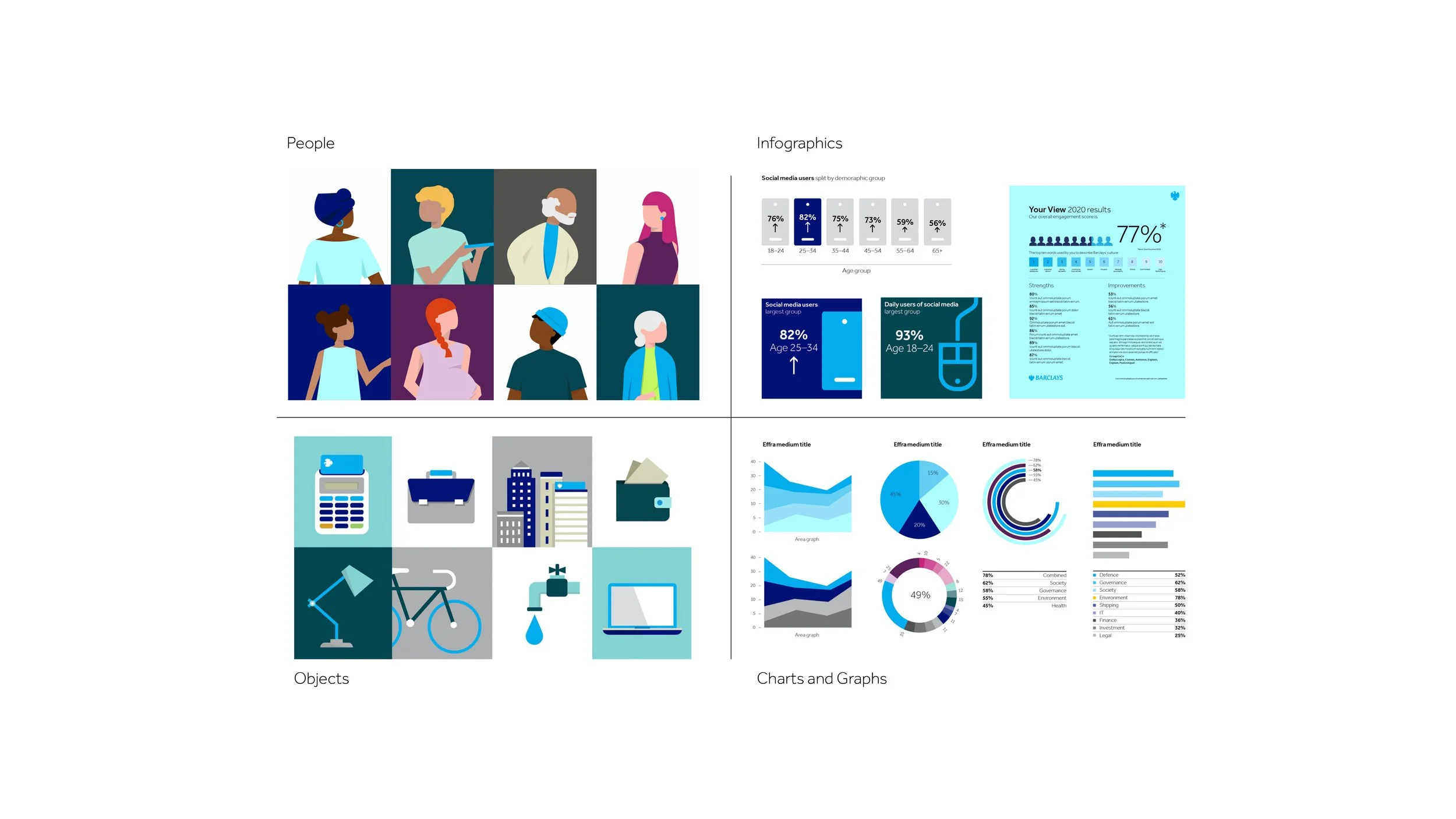
I worked as one of the Design Directors on the Landor team responsible for developing photography styling across Barclays business units. From Community and Corporate Banking to Investment Banking and Private Bank. I also worked with an illustrator to develop the illustration style, and I created the infographics style and principles. All of which were brought to life in motion for all digital platforms in collaboration with the digital team.
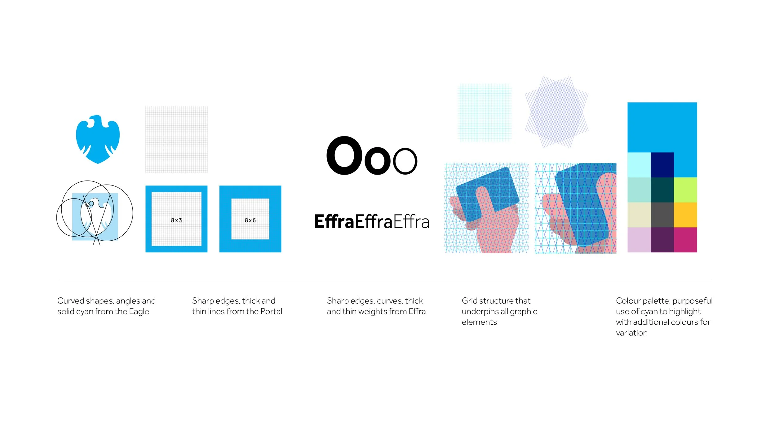
The core sacred assets – the Eagle and the Portal – were used to help create a set of principles that could be built on for the graphic style. For it to work as a direction, I had to show the relationship between the primary graphic style and infographics. The same design cues from some of the core brand elements were used to influence the styling.
Photography courtesy of Getty images