






Norway’s biggest company Statoil changed their name to Equinor in 2018. The name change followed their new strategy for the investment, development and transition to renewable energy. The name change to Equinor along with a new brand identity was designed to signal that transition. Equinor is a combination: the first part originates from words such as ‘equal’, ‘equality’, and ‘equilibrium’. The second part, ‘nor’ signals a company proud of its Norwegian origins.
As one of the senior creatives at Superunion my role was to design develop different basic elements of the visual identity and then to work with the custom designed brand portal to upload content and write brand system guidelines.
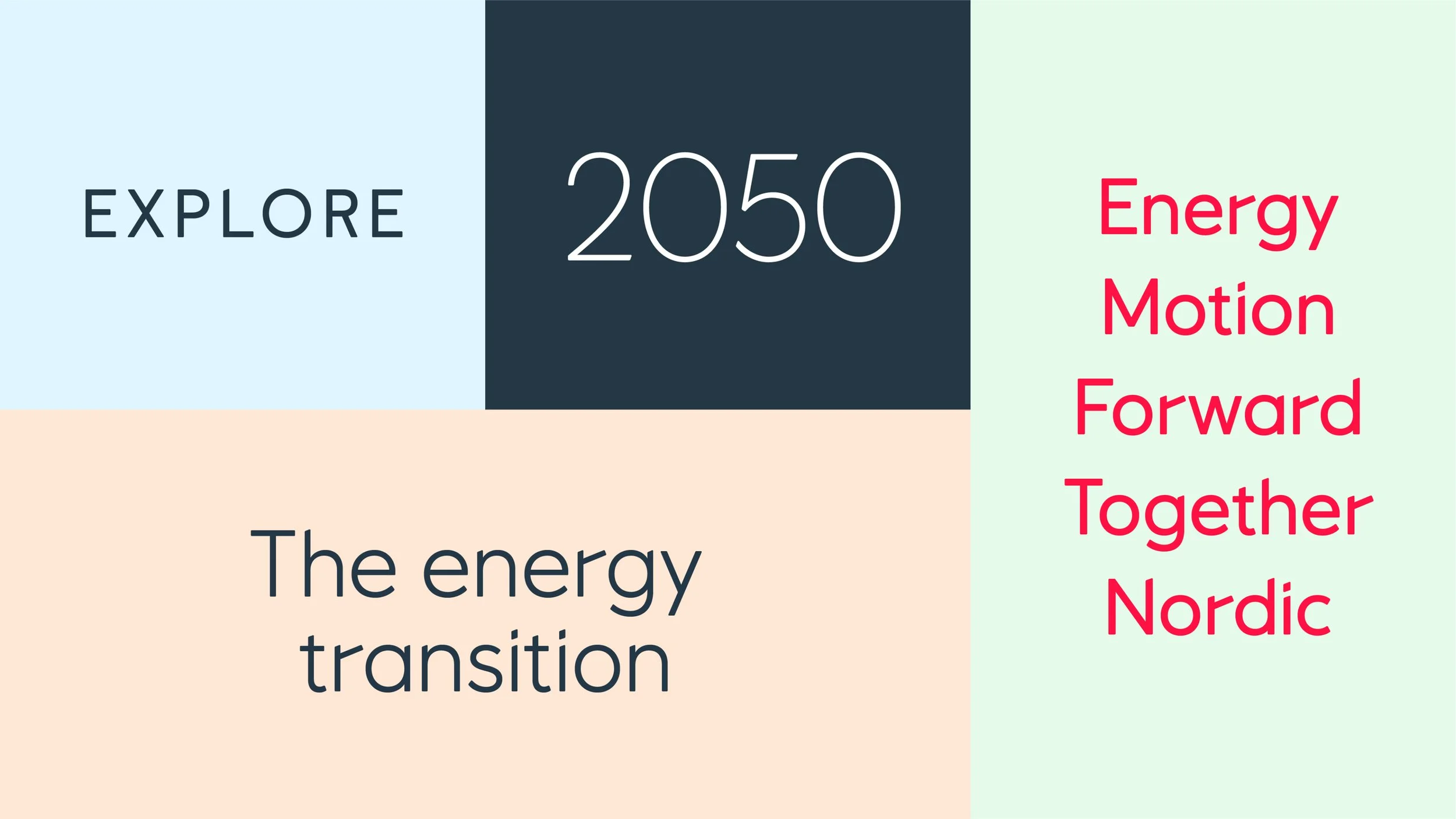
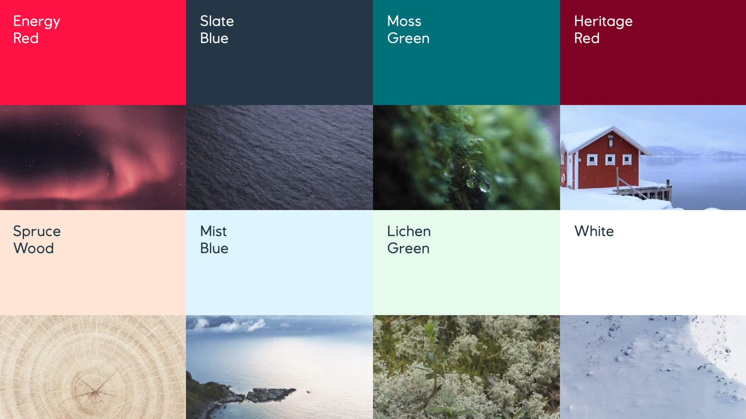
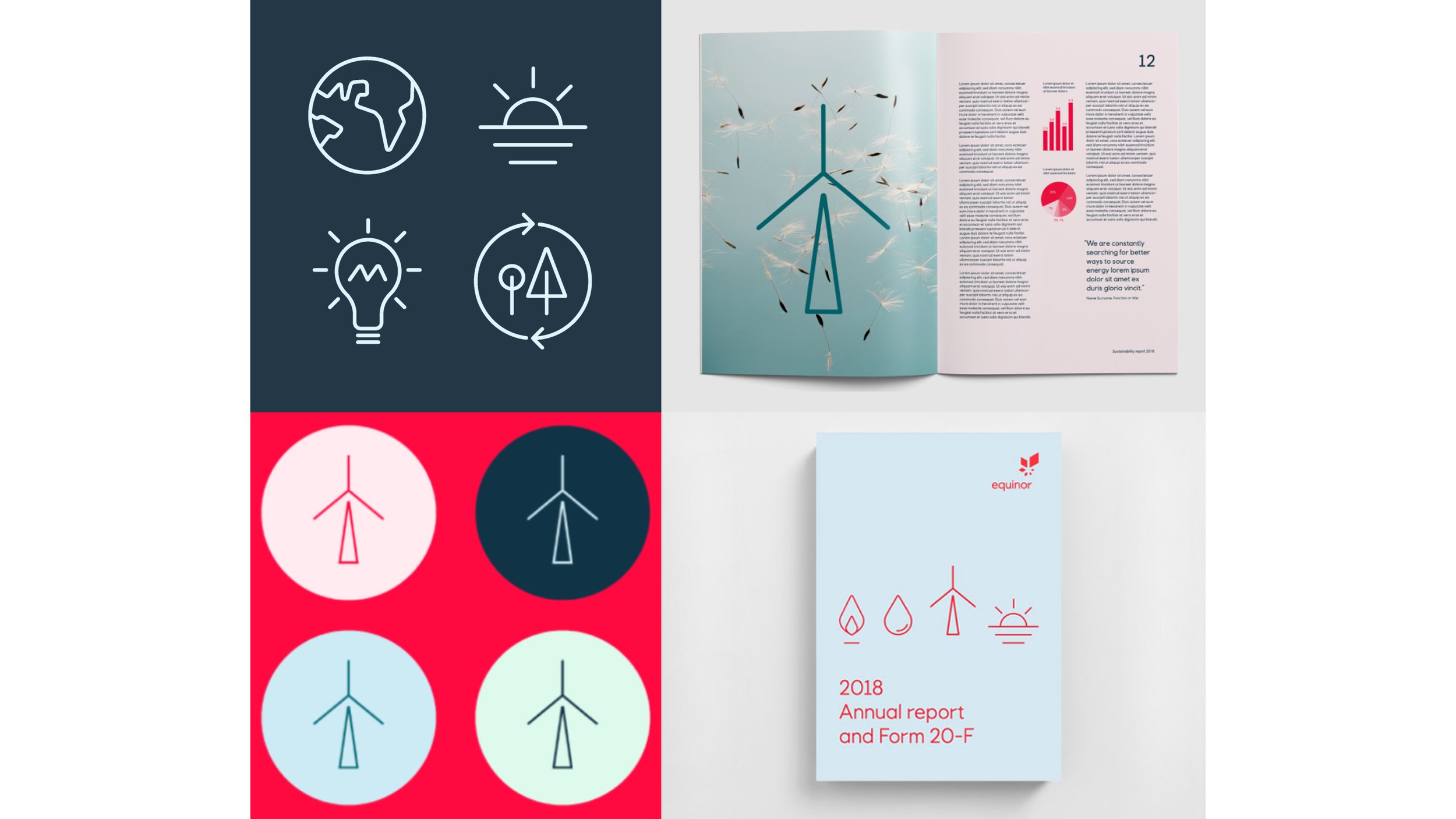
A completely new visual identity was developed. Colour was inspired by the Norwegian landscape, a custom typeface with ‘North Star’ angled ligatures was commissioned, a distinctive illustration and icon language was designed, and a unique design system was created.
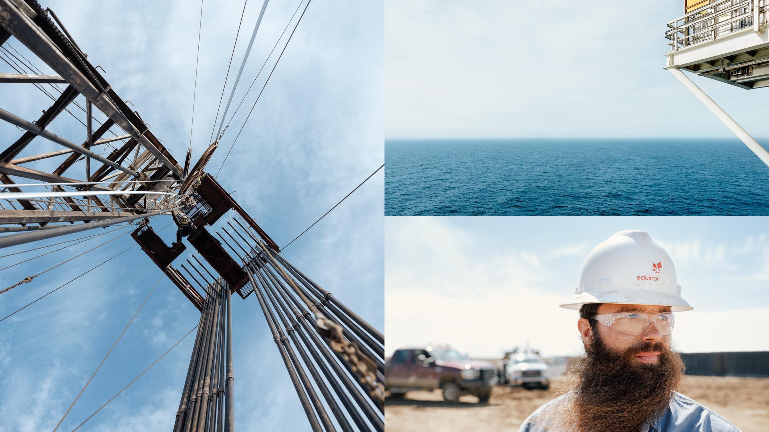
Brand photography was shot by Norwegian photographer Einar Aslaksen. Locations included; Oslo and Stavanger, Stord, Melkøya, the Gina Krogh platform in the North Sea. Williston, North Dakota US, Rio de Janeiro and Apodi in Brazil.
Agency: Superunion